What Your Menu Is Actually Telling You: The Hidden Strategy Behind Every Restaurant's Design
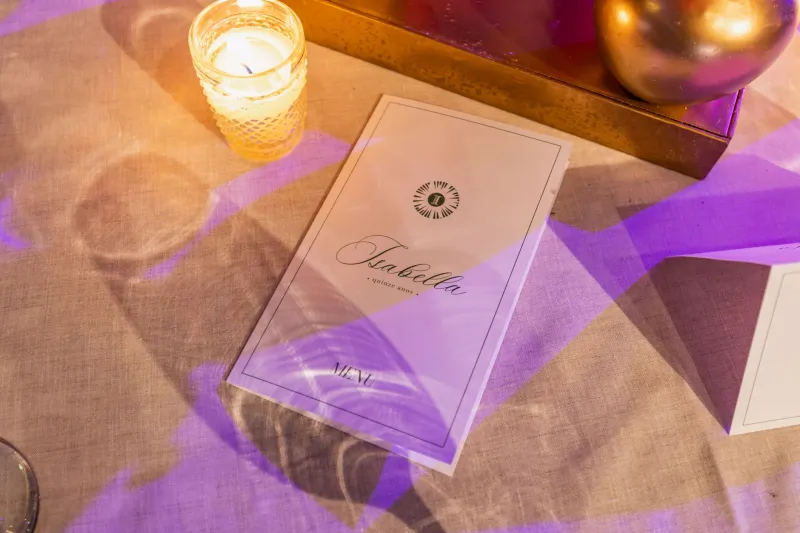
You sit down at a restaurant, the server hands you a menu, and you spend a few minutes deciding what sounds good. Simple enough, right? Not quite. That document — whether it's a chalkboard, a glossy booklet, or a QR code on your phone — has been engineered with surprising precision. Chefs, restaurant consultants, and graphic designers have spent real time and money figuring out exactly how to nudge you toward certain dishes. And spoiler: it works on most of us.
At TriMenu, we're big believers in intentional dining. So let's pull back the curtain on menu architecture — the science of how restaurants design their menus to shape your order — and talk about how you can use that knowledge to eat smarter and discover dishes you'll actually love.
The "Sweet Spot" Isn't an Accident
Restaurant industry insiders have long known about something called the "golden triangle" of menu reading. Studies on eye-tracking behavior suggest that when diners open a standard two-page menu, their eyes tend to travel first to the upper-right corner, then to the top of the left page, then back to the center. Restaurants that know this (and most serious ones do) place their highest-margin items right in those zones.
Think about it: the dish your eye lands on first is rarely the cheapest thing on the menu. It's usually a beautifully described entrée with ingredients that sound premium but cost the kitchen relatively little to produce. That's not coincidence — that's strategy.
On longer menus, the same principle applies in a vertical sense. Items at the top and bottom of a section get more attention than those buried in the middle. If you're the kind of diner who always gravitates toward the first or last option in a category, you've been playing right into the restaurant's hands.
The Price Anchoring Game
Here's a pricing trick that's almost universal: restaurants deliberately include one or two outrageously expensive items on the menu — a $95 wagyu steak, a $60 whole branzino — not necessarily because they expect to sell a lot of them, but because those prices make everything else feel reasonable by comparison.
This is called price anchoring, and it's a well-documented psychological phenomenon. Once your brain registers that a steak costs $95, the $38 pasta suddenly feels like a bargain. The restaurant wins either way: you either order the anchor item (great margin) or you feel comfortable spending more than you planned because you're "saving" compared to the most expensive thing.
Also worth noting: menus that drop the dollar sign entirely — listing prices as "28" instead of "$28" — have been shown to increase spending. The visual cue of a currency symbol triggers a pain response in the brain associated with spending money. Remove the symbol, and diners tend to order more freely.
Descriptive Language Does the Heavy Lifting
Read a menu closely and you'll notice that not all dishes are described equally. The items the kitchen wants you to order get the full treatment: evocative adjectives, origin stories for ingredients, technique callouts. "Slow-braised short rib with heirloom carrot purée and a Calabrian chili gremolata" sounds a lot more compelling than "beef with carrots and peppers" — even if the underlying dish is similar.
Research from Cornell University found that descriptive menu labels increased sales of those items by nearly 30 percent compared to plain listings. Words like "house-made," "locally sourced," "grandmother's recipe," or "wood-fired" do real psychological work. They create a sense of value, authenticity, and specialness that justifies a higher price point and makes the dish feel worth choosing.
Chefs and menu writers also use sensory language strategically. Words that evoke texture ("crispy," "silky," "charred") and temperature ("warm," "chilled") help diners mentally taste a dish before ordering, making them more likely to commit to it.
How Boxes, Icons, and Photos Manipulate Your Gaze
Another tool in the menu architect's kit: visual callouts. A dish highlighted in a box, tagged with a small icon ("Chef's Favorite," "Most Popular," "Award-Winning"), or accompanied by a photograph draws the eye and signals importance. Diners tend to interpret these cues as social proof — if it's popular or the chef recommends it, it must be good.
Photographs are a double-edged sword. High-end restaurants often avoid them entirely, since images can feel cheap or fast-casual. But when photos do appear, studies consistently show that they increase orders of the pictured items by up to 30 percent. Budget-conscious restaurants and chain spots use this liberally. Fine dining establishments lean on language instead.
How to Navigate a Menu with Intention
So now that you know how the game is played, how do you play it better? A few practical strategies:
Scan the middle before the edges. The dishes buried in the middle of a section — the ones without boxes or photos — are often the kitchen's most honest cooking. They're there because the chef believes in them, not because a consultant said they'd sell.
Ask your server what the kitchen is proud of. This is genuinely underused. Servers at good restaurants know which dishes represent the chef's vision versus which ones are there for mass appeal. A simple "what do you love here?" opens doors.
Ignore the anchor items, but let them inform you. If a menu has a $75 item, use it to recalibrate your expectations for the price range — then look at what the kitchen does at the $28–$38 level. That's often where the soul of the menu lives.
Pay attention to what's listed first in a section. Restaurants frequently lead with their signature or highest-margin items. Reading past the first one or two options in a category often reveals more interesting, lower-profile dishes.
Trust brevity. A focused menu with 20–25 items almost always signals a kitchen that's cooking with intention. A menu with 80 options is either running a commissary kitchen or relying heavily on frozen product. Fewer dishes usually means more care.
The Takeaway
Menus are one of the most fascinating intersections of psychology, design, and culinary art. Restaurants invest real resources into making sure you order in a way that's good for their bottom line — and there's nothing wrong with that. It's business. But as a diner, understanding the architecture behind the menu means you can make choices that are good for your experience.
The best meals happen when you're ordering from genuine curiosity rather than engineered nudges. Next time you sit down with a menu in hand, take an extra minute to look past the golden triangle, the anchor prices, and the glowing callouts. The dish you were meant to find might be the quietest one on the page.